Posted on 25 October 2011
TIMEMAPS: a different perspective
This article is the first of two articles detailing the impementation of the TIMEMAPS project. This one details the rendering techniques used in the TIMEMAPS project and how the map deformes based on the travel times between cities.
This article is the second in a series about the TIMEMAPS project. TIMEMAPS' concept and design are by Vincent Meertens, the implementation is by me.
Drawing the map with Canvas
The visualziation is done using the HTML5 canvas. Why canvas, and not just SVG, one would ask? Good question: I wanted to learn more about the canvas and thus was a bit biased. I think the project could have been done with SVG as well.
The map consists of a set of polygons: the main country outline and its various islands. On those shapes are the cities located: all 379 train stations. Furthermore, there are several bridges between the islands, like the big “afsluitduik”, which each connect 2 vertices of the polygons.
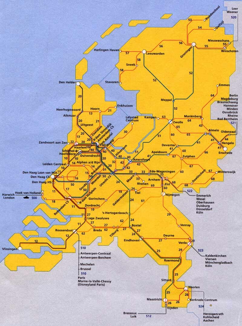
The initial, un-transformed shape of the country and the station positions is the same as that on the famous yellow overview map that the NS uses in the stations: it is a schematical view of the Netherlands, constrained in a grid of 0, 45 and 90-degree lines.
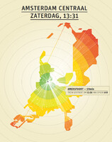
The drawing algorithm first draws all the polygons and bridges, and subsequently fills those areas with a pattern of colored concentric circles. This is done in canvas by blitting the previous shape with a pre-rendered image of the circles using the compositeOperation method. The distances between the circles are scaled to represent 30 minutes of travel time. Then, the cities are drawn as big/small dots (main stations are bigger) and connected to the current city by a thin white line.
The information hovers (a plain HTML div) is done by using the “mousemove” event on the canvas and calculating which city is the closest to the current mouse location. Clicking a city causes the current perspective to shift to the clicked city in an animated fashion, using a simple (cosine) transition.
Map deformation
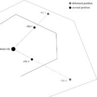
The angles at which cities view each other are kept constant. So, for example, viewed from Rotterdam, Utrecht centraal is always at a 45-degree angle, regardless of the time it takes to travel from Rotterdam to Utrecht. The actual city location is scaled proportionaly along these angles: if it takes less time to travel, the city is pulled closer; if it takes more time it is pushed further away. But the angle remains constant.
The polygons (that make the actual shape of the map) are “magnetic” and each vertex “sticks” to the cities it is initially closest to, in a weighted fashion. This algorithm is loosely based on the article “Feature point based mesh animation applied to MPEG-4 facial animation”.
For the islands, this mesh-stretching was mixed 60%/40% with a simple vertex displacement to prevent the islands from becoming unrecognizable: since there are no stations on islands, they are prone to more deformation since the feature points (cities) lie further away.
Problems in the visualization
The shape of the map sometimes is deformed beyond recognition because in certain cases cities which are normally close are being pushed away beyond cities that are normally far away: thus causing the polygon to turn “inside out” and cause cities to appear to be located in the sea.
Another issue is the 45-degree grid constraint: the mesh stretching algorithm does not take this into account because this constraint is applied in a later calculation stage: this sometimes causes cities to be located in the sea as well. A temporary solution for this was to add more vertices to the polygons so the map had more flexibility while stretching.
Application to other maps
The netherlands is a pretty ideal country in the way the transportation system is organized: viewed from the center, “de randstad”, or utrecht or amersfoort, it is indeed so that travel times do increase almost linearly with geographical distance. I do not think this holds for every country: especially with the advance of faster railways (the fast Fyra train was not taken into account in our implementation!), the map might deform in ways that are beyond recognition and beyond representation in the 2D domain.
However it might be an interesting experiment to apply the same techniques to a different country.
« Previous article Next article »


